We design mobile friendly websites that work seamlessly on all devices.
Since 2015, Google has made mobile-friendliness a ranking factor in search results. Websites that are not optimized for mobile devices rank lower on mobile search and are clearly flagged as such. This reflects how people now search: primarily on smartphones and tablets.
Today, most local searches happen on mobile. A website must work well on all screen sizes to be effective. We design fully responsive sites that adapt smoothly to any device while preserving your visual identity.
Be Fully Responsive
50%
of local internet search is done on smartphones and tablets*
48%
of users who visit a website that isn’t mobile-friendly think that the company doesn’t care about their business**
61%
of smartphone and tablet users will exit a website if it is not mobile-friendly**
64%
of American adults own a smartphone in 2015*
* Source: Pew Research
** Source: Google’s Think Insights
These are not optional considerations anymore. A website must work properly on any device. Responsive design means your site adapts to each screen size, rather than showing a scaled-down desktop version, while preserving your visual identity.




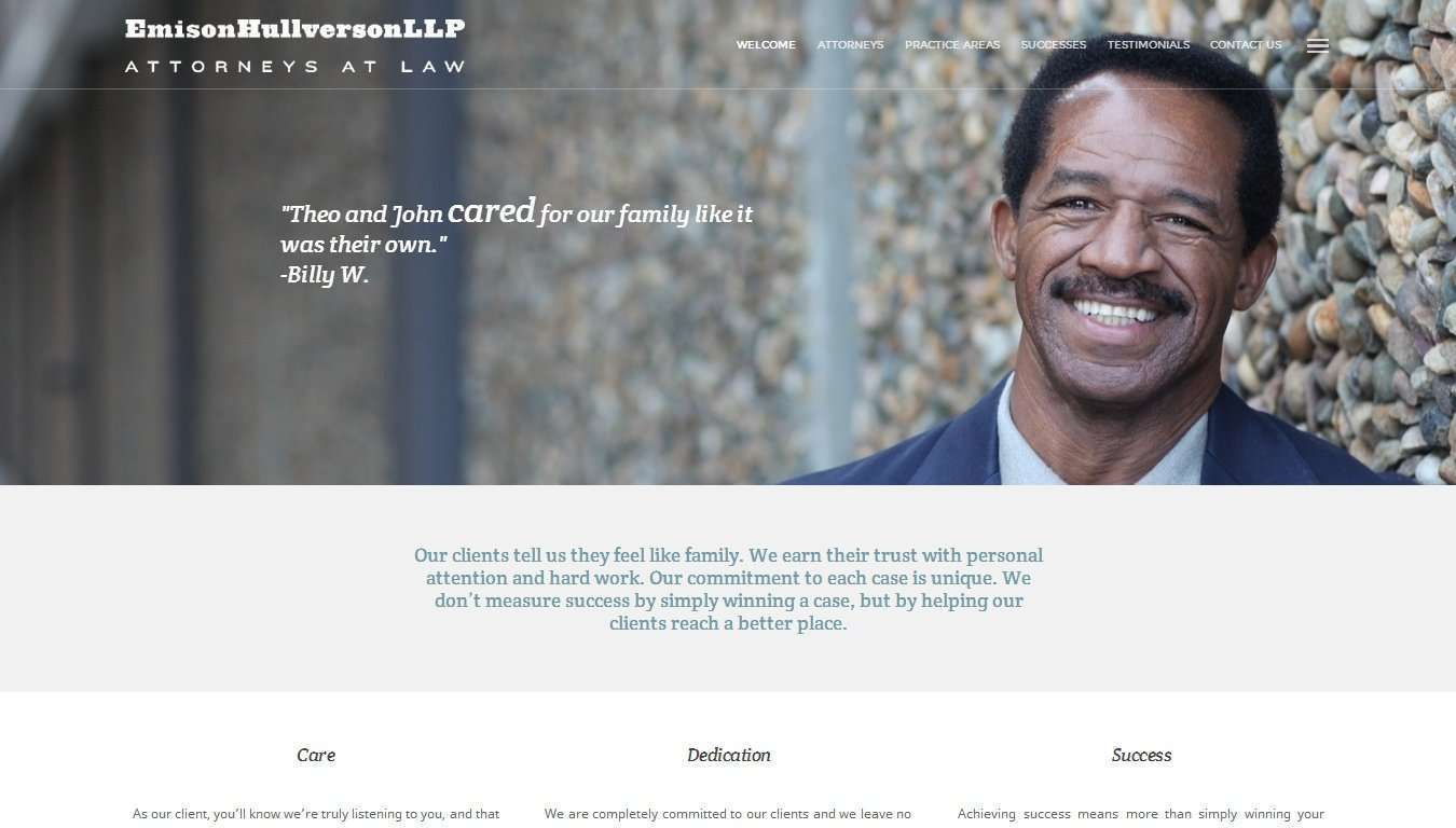
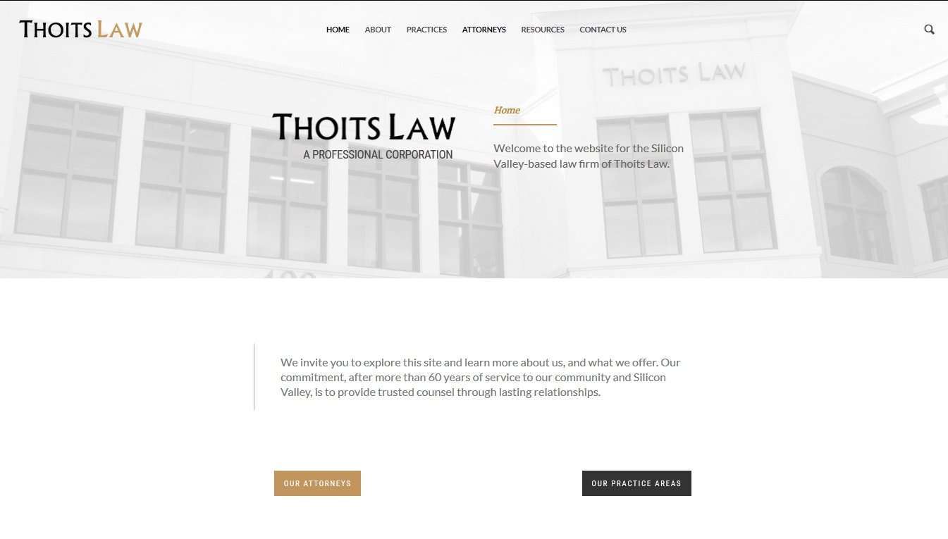
Web Designs Packed with Premium Features
We tailor the design of each website to your brand and requirements, while providing the same set of essential, high-quality features on every project.
- Fully Responsive
Adapts to any screen size and any mobile device - Optimized for Search Engines
Coded with search engines in mind, with perfect use of tags, descriptions, permalinks structure - Integrated with your social media accounts
With links to all social platforms so that your users and network can find you anywhere - Retina-Ready
To display in high definition
- At the forefront of Design
Including parallax effects, full-width backgrounds, picture animations and sliders - Fully functional
With working contact/appointment forms, downloadable intake forms, etc. - Engaging
Keep your readers updated on your latest news and opinons; allow them to interact with comments and reviews - A source of information
We integrate your site with Google Analtyics, the best tool on the market, to allow you to track your traffic and visitors, and know your audience better
Our goal is to deliver a mobile-friendly, reliable website that represents your brand clearly and is easy for your audience to use.
Thinking about a new project?
We work exclusively with law firms. We know the space, we know what works, and we’re not interested in overpromising. If that sounds like the kind of agency you’ve been looking for, we’d like to hear from you.